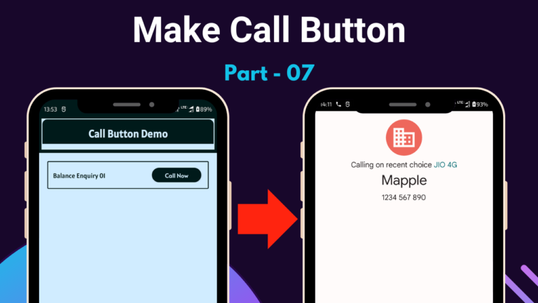
In this blog, we have to create a call button layout design, and Java backend code is also implemented in this project. So we have to start the step-wise design given below.
1st, we have to create the constraint layout code given below.
<?xml version="1.0" encoding="utf-8"?>
<androidx.constraintlayout.widget.ConstraintLayout xmlns:android="http://schemas.android.com/apk/res/android"
    xmlns:app="http://schemas.android.com/apk/res-auto"
    xmlns:tools="http://schemas.android.com/tools"
    android:layout_width="match_parent"
    android:layout_height="match_parent"
    android:background="@color/teal_200"
    android:fitsSystemWindows="true"
    tools:context=".MainActivity">

</androidx.constraintlayout.widget.ConstraintLayout>2nd, we have to create another constraint layout code given below.
    <androidx.constraintlayout.widget.ConstraintLayout
        android:id="@+id/constraintLayout01"
        android:layout_width="0dp"
        android:layout_height="75dp"
        android:layout_margin="4dp"
        android:layout_marginStart="4dp"
        android:layout_marginEnd="4dp"
        android:background="@color/purple_200"
        android:padding="2dp"
        app:layout_constraintBottom_toBottomOf="parent"
        app:layout_constraintEnd_toEndOf="parent"
        app:layout_constraintStart_toStartOf="parent"
        app:layout_constraintTop_toTopOf="parent"
        app:layout_constraintVertical_bias="0">

    </androidx.constraintlayout.widget.ConstraintLayout>
3rd, we have to create a toolbar_bg.xml layout which helps to design a toolbar layout.
<?xml version="1.0" encoding="utf-8"?>
<shape xmlns:android="http://schemas.android.com/apk/res/android"
    android:shape="rectangle">

    <corners android:radius="12dp" />
    <solid android:color="@color/purple_200" />

</shape>4th, we have to create a constraint layout that can control toolbar design and under this constraint layout, we can implement one text view and one view layout which is given below.
  <androidx.constraintlayout.widget.ConstraintLayout
            android:id="@+id/constraintLayout02"
            android:layout_width="0dp"
            android:layout_height="0dp"
            android:background="@drawable/toolbar_bg"
            app:layout_constraintBottom_toBottomOf="parent"
            app:layout_constraintEnd_toEndOf="parent"
            app:layout_constraintStart_toStartOf="parent"
            app:layout_constraintTop_toTopOf="parent">

</androidx.constraintlayout.widget.ConstraintLayout>5th, we have to create a text view layout that shows the title of the application given below.
            <TextView
                android:id="@+id/bankNameTV"
                android:layout_width="0dp"
                android:layout_height="wrap_content"
                android:fontFamily="@font/alatsi"
                android:gravity="center_horizontal"
                android:shadowColor="@color/black"
                android:shadowDx="1.5"
                android:shadowDy="1.3"
                android:shadowRadius="1.6"
                android:text="@string/app_name"
                android:textColor="@color/teal_200"
                android:textSize="26sp"
                android:textStyle="bold"
                app:layout_constraintBottom_toBottomOf="parent"
                app:layout_constraintEnd_toEndOf="parent"
                app:layout_constraintStart_toStartOf="parent"
                app:layout_constraintTop_toTopOf="parent"
                app:layout_constraintVertical_bias="0.4" />
6th, we have to create a view layout which helps to design the toolbar layout is given below.
            <View
                android:id="@+id/view"
                android:layout_width="0dp"
                android:layout_height="12dp"
                android:background="@color/teal_200"
                app:layout_constraintBottom_toBottomOf="parent"
                app:layout_constraintEnd_toEndOf="parent"
                app:layout_constraintStart_toStartOf="parent"
                app:layout_constraintTop_toBottomOf="@+id/bankNameTV"
                app:layout_constraintVertical_bias="1" />
7th, we have to create a view layout design which helps to use divider only.
<View
        android:id="@+id/view02"
        android:layout_width="match_parent"
        android:layout_height="8dp"
        app:layout_constraintEnd_toEndOf="parent"
        app:layout_constraintStart_toStartOf="parent"
app:layout_constraintTop_toBottomOf="@+id/constraintLayout01" />8th, we have to create another constraint layout to design the call button system under this layout.
    <androidx.constraintlayout.widget.ConstraintLayout
        android:id="@+id/constraintLayout03"
        android:layout_width="0dp"
        android:layout_height="0dp"
        android:background="@color/teal_200"
        android:paddingLeft="12dp"
        android:paddingTop="12dp"
        android:paddingRight="12dp"
        app:layout_constraintBottom_toBottomOf="parent"
        app:layout_constraintEnd_toEndOf="parent"
        app:layout_constraintStart_toStartOf="parent"
        app:layout_constraintTop_toBottomOf="@+id/view02">

    </androidx.constraintlayout.widget.ConstraintLayout>
9th, we have to create a NestedScrollView layout which helps to scroll content under this layout.
        <androidx.core.widget.NestedScrollView
            android:id="@+id/nestedScrollView"
            android:layout_width="0dp"
            android:layout_height="0dp"
            app:layout_constraintBottom_toBottomOf="parent"
            app:layout_constraintEnd_toEndOf="parent"
            app:layout_constraintStart_toStartOf="parent"
            app:layout_constraintTop_toTopOf="parent">

        </androidx.core.widget.NestedScrollView>
10th, we have to create a linear layout that can be used to show content in a vertical direction are given below,
            <LinearLayout
                android:layout_width="match_parent"
                android:layout_height="match_parent"
                android:orientation="vertical">

            </LinearLayout>
11th, we have to create a card_bg.xml layout under the drawable layout to design cardview background.
<?xml version="1.0" encoding="utf-8"?>
<shape xmlns:android="http://schemas.android.com/apk/res/android"
    android:shape="rectangle">

    <stroke
        android:width="2dp"
        android:color="@color/purple_200" />

    <solid android:color="@color/teal_200" />
    <corners android:radius="2dp" />

</shape>12th, we have to create another constraint layout design and under this constraint layout design, we have to insert one text view and one card button given below.
                <androidx.constraintlayout.widget.ConstraintLayout
                    android:id="@+id/constraintLayout04"
                    android:layout_width="match_parent"
                    android:layout_margin="8dp"
                    android:layout_marginStart="8dp"
                    app:layout_constraintEnd_toEndOf="parent"
                    app:layout_constraintStart_toStartOf="parent"
                    app:layout_constraintTop_toTopOf="parent"
                    android:layout_marginEnd="8dp"
                    android:background="@drawable/card_bg"
                    android:paddingTop="16dp"
                    android:paddingBottom="16dp"
                    android:visibility="visible"
                    android:layout_height="wrap_content">

                </androidx.constraintlayout.widget.ConstraintLayout>
13th, we have to insert text view under the constraint layout design given below.
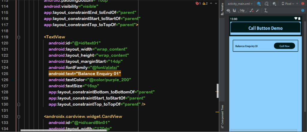
                    <TextView
                        android:id="@+id/text01"
                        android:layout_width="wrap_content"
                        android:layout_height="wrap_content"
                        android:layout_marginStart="14dp"
                        android:fontFamily="@font/alatsi"
                        android:text="Balance Enquiry 01"
                        android:textColor="@color/purple_200"
                        android:textSize="16sp"
                        app:layout_constraintBottom_toBottomOf="parent"
                        app:layout_constraintStart_toStartOf="parent"
                        app:layout_constraintTop_toTopOf="parent" />
14th, we have to create a CardView layout that can be used as a button that can integrate a call button function with the help of a cardview layout.
                    <androidx.cardview.widget.CardView
                        android:id="@+id/cardBtn01"
                        android:layout_width="120dp"
                        android:layout_height="35dp"
                        android:layout_marginEnd="18dp"
                        android:clickable="true"
                        android:elevation="2dp"
                        android:focusable="true"
                        android:foreground="?attr/selectableItemBackground"
                        app:cardBackgroundColor="@color/purple_200"
                        app:cardCornerRadius="100dp"
                        app:layout_constraintBottom_toBottomOf="parent"
                        app:layout_constraintEnd_toEndOf="parent"
                        app:layout_constraintTop_toTopOf="parent">

                    </androidx.cardview.widget.CardView>
15th, again we have to create a constraint layout that can be used for cardview button design purposes.
                        <androidx.constraintlayout.widget.ConstraintLayout
                            android:layout_width="match_parent"
                            android:layout_height="match_parent">

                        </androidx.constraintlayout.widget.ConstraintLayout>
16th, we have to make a call button that can show calls now with the help of the TextView layout given below.
                            <TextView
                                android:layout_width="wrap_content"
                                android:layout_height="wrap_content"
                                android:fontFamily="@font/alata"
                                android:text="Call Now"
                                android:textColor="@color/teal_200"
                                android:textSize="14sp"
                                android:textStyle="bold"
                                app:layout_constraintBottom_toBottomOf="parent"
                                app:layout_constraintEnd_toEndOf="parent"
                                app:layout_constraintStart_toStartOf="parent"
                                app:layout_constraintTop_toTopOf="parent" />